


Cloaking technology protects your Flow from moderation. But when a real user actually lands on the offer - another game begins. The one where psychology wins, not the technical stack. Let's break down why some landing pages convert twice as well as identical offers - and what to do about it.
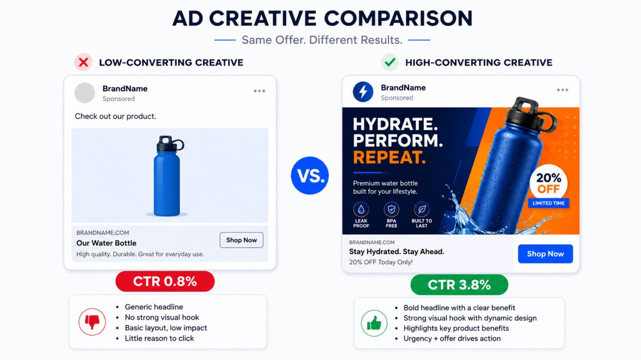
Why most landing pages don't work
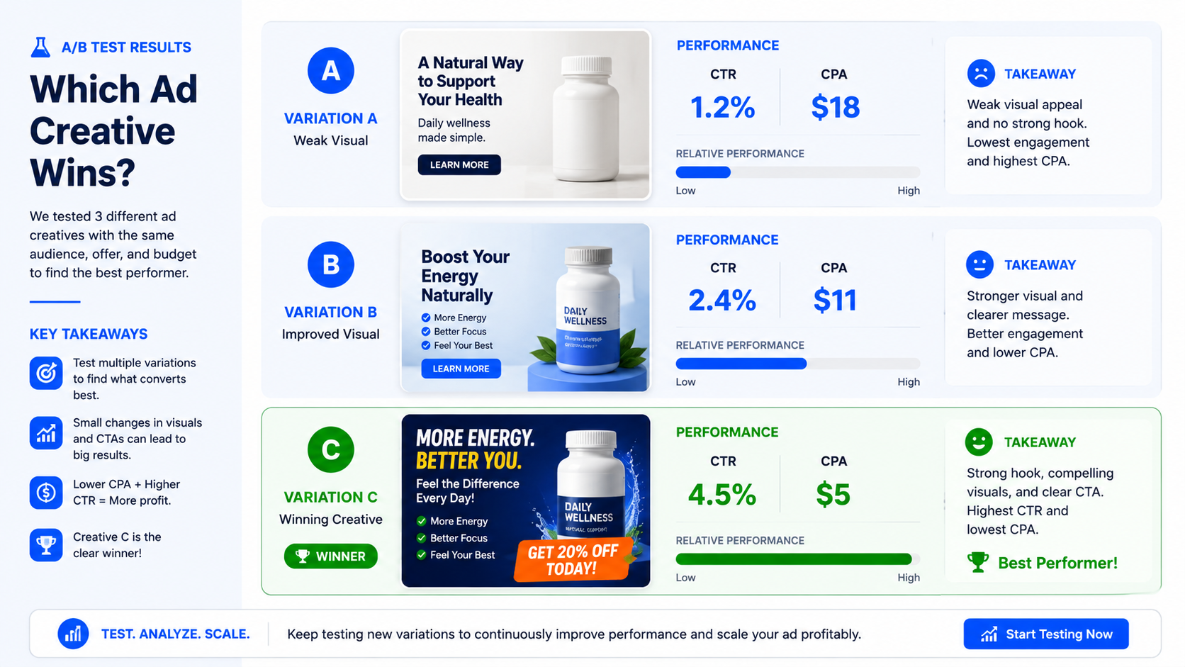
Let's start with the non-obvious. Most arbitrageurs copy competitors' Flows through SPY services and wonder why the result is worse. The reason is not in the offer and not in the traffic source - the reason is that you see the final version of the landing page after 30 iterations of A/B tests. And you are driving traffic to the first iteration.
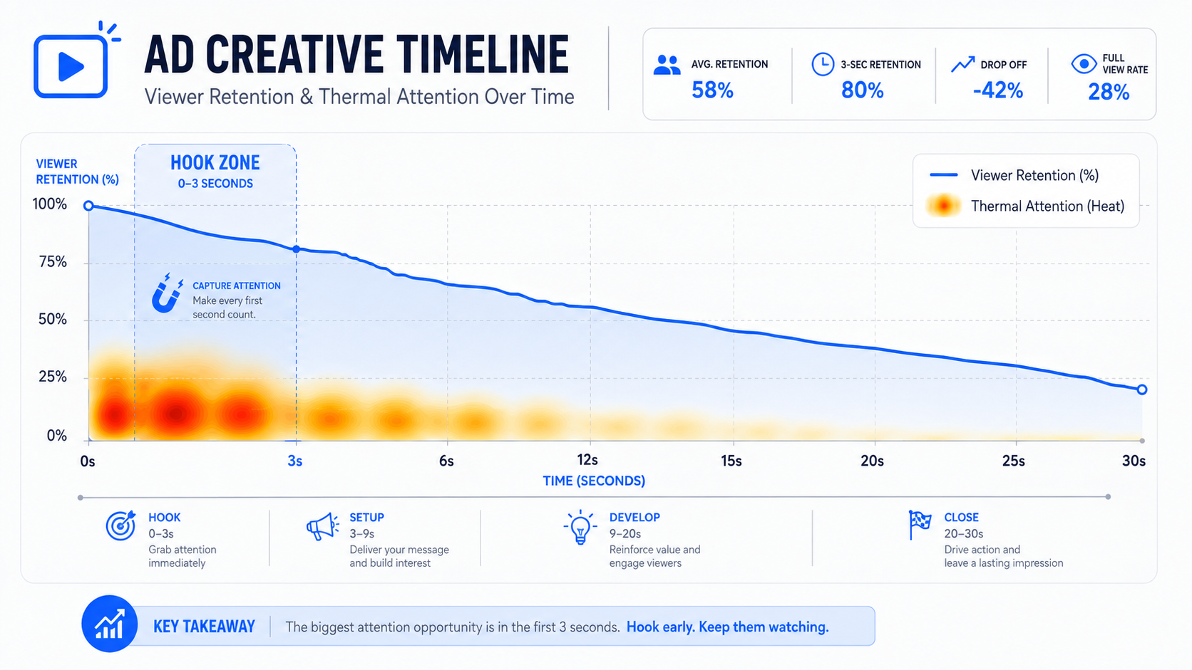
The second problem: buyers think of a landing page as a "page with a button". But the user thinks differently. In 3-8 seconds, they make a decision - to leave or to stay. And this decision is driven not by logic, but by a set of psychological triggers that are either on the page or not.
First screen: three seconds for everything
This is the most important place on any landing page. The first screen is what the user sees without scrolling. Everything else exists for those who were hooked by the first screen.
What should be on the first screen:
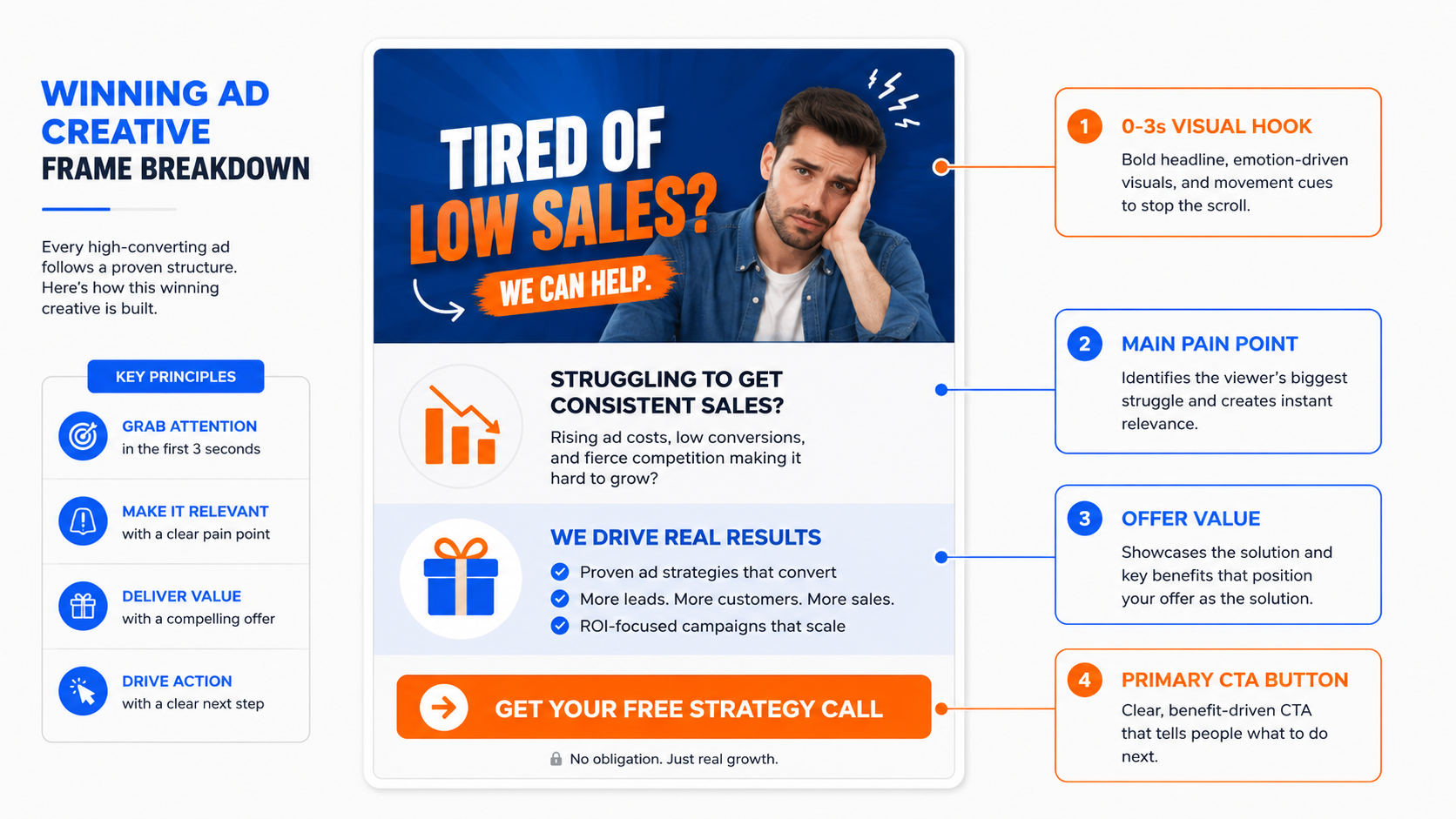
Headline with a pain or desire - not a description of the product, but a formulation of what the person wants or what they want to get rid of. "Lose 8 kg without diets" works better than "Innovative weight loss complex". "Start with 500 rubles and withdraw today" works better than "The best online casino of 2026".
Visual anchor - an image of the result, not the process. In nutra: a "before/after" photo or a happy person with the result. In gambling: a large winning amount or a visual metaphor of winning.
One clear CTA - not three buttons with different texts. One call to action, one color, one action.
Social proof: nothing works without it
This is one of the most powerful triggers that is regularly underestimated or done wrong.
What works in nutra:
- Real reviews with a name, photo, and a specific result ("Minus 7 kg in 3 weeks, Marina, 34 years old"). Not "great product!!!". Specifics.
- A star rating next to the reviews - at least 4.7/5, otherwise it works against you.
- "How many people have already ordered" - a counter with a live number increases the conversion rate.
What works in gambling:
- Screenshots of winnings with a name and amount - preferably with realistic amounts ($230, $890), not fairy-tale millions.
- "Latest winners" - a live block with names and winnings creates a feeling of activity.
- The number of players online right now.
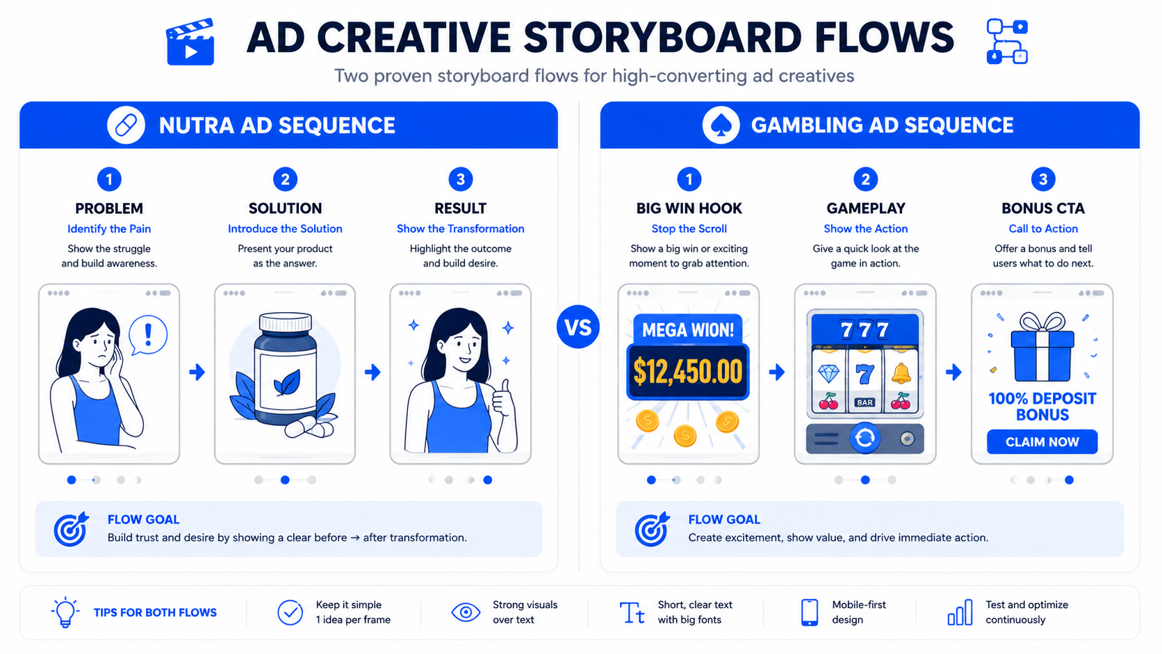
Key rule: social proof must be specific and believable. Reviews that are too perfect work worse than imperfect but realistic ones.
Trigger of urgency and scarcity
One of the most used - and one of the most misused triggers.
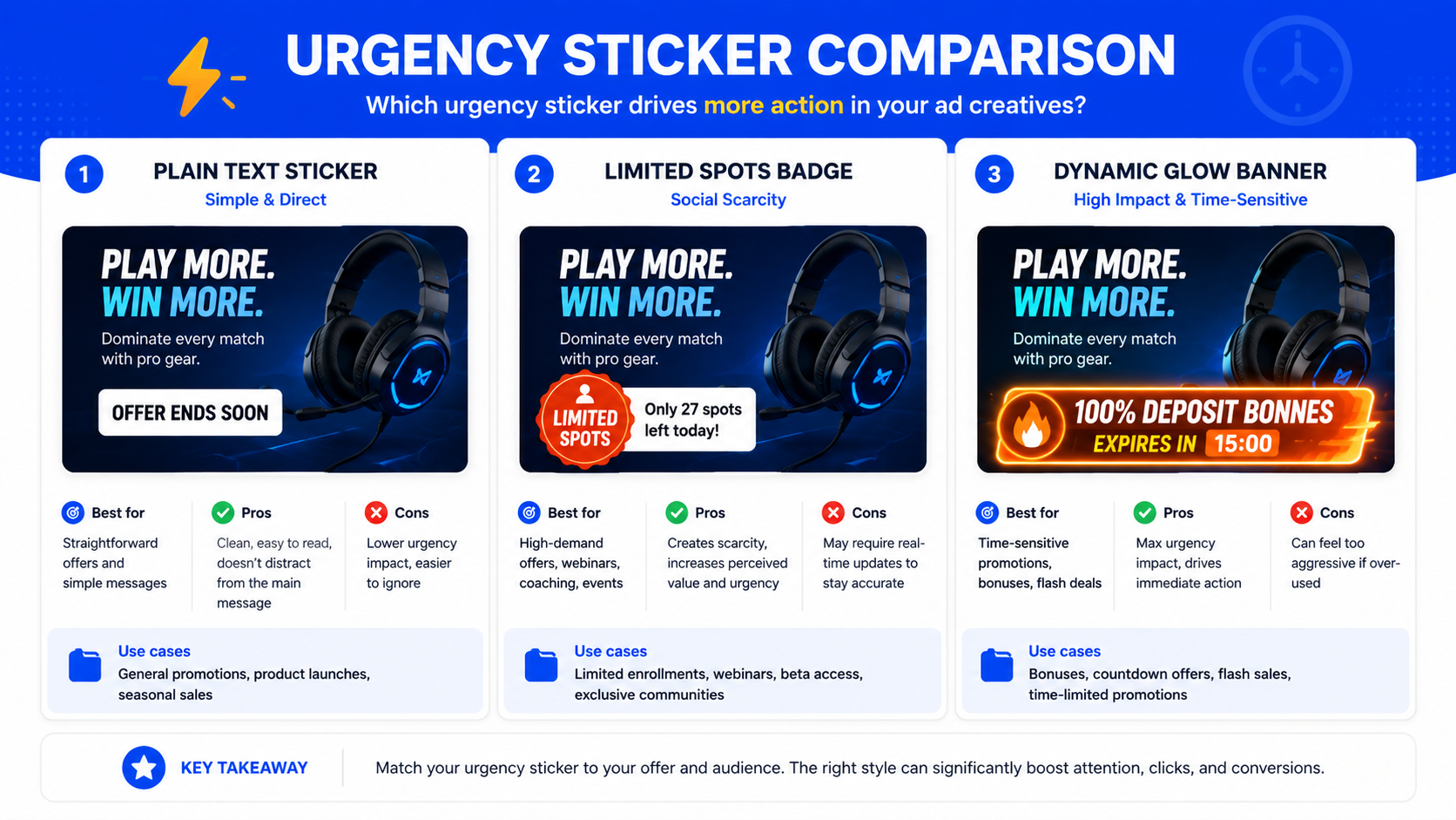
Countdown timer - works if the timer's expiration actually changes something (price, quantity). Doesn't work if the timer restarts when the page is refreshed. Users in 2026 know this technique perfectly well, and a fake timer causes distrust.
"X items left" - works in nutra, especially with a specific number (not "few", but "3 packages left at this price"). For gambling - not relevant.
Promotion with a deadline - "100% deposit bonus only until the end of the day" in gambling creates a real reason to act now.
Landing page structure for nutra vs for gambling
These are different audiences with different psychology - and the page structure should reflect this.
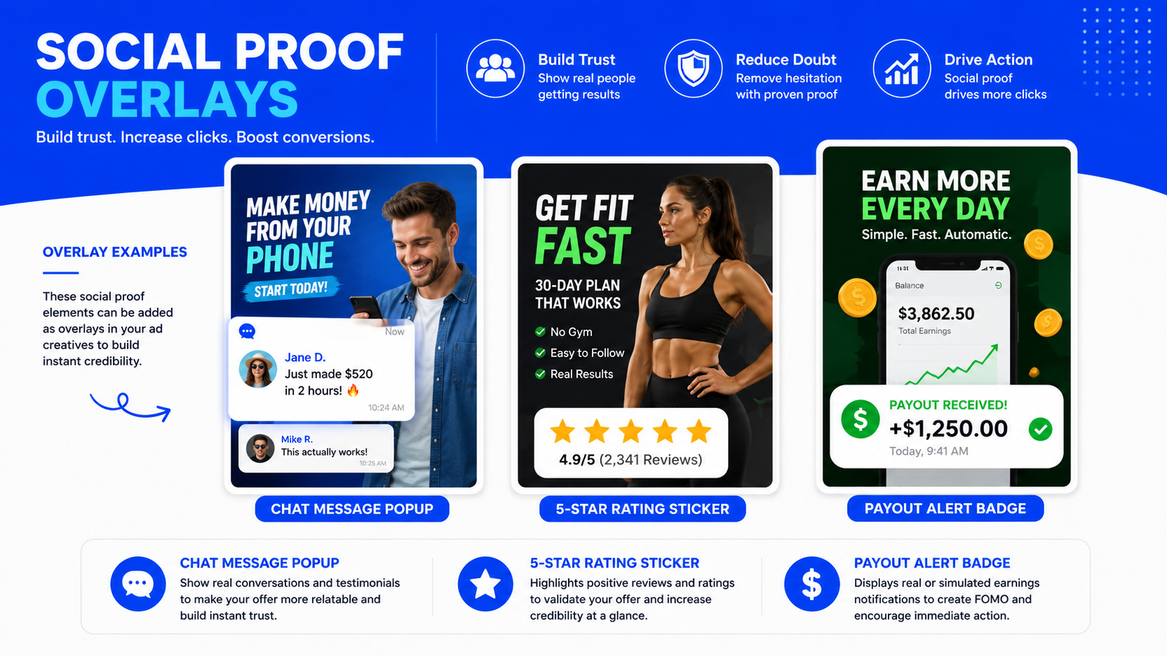
Nutra landing page (via pre-lander):
- Pre-lander - a neutral "story" (news format, blog, celebrity review). Task: to warm up trust and curiosity.
- First screen of the offer: pain → solution → CTA
- "How it works" block - simple product mechanics
- Social proof - reviews with photos and results
- Composition / ingredients - for those who think rationally
- Money-back guarantee - removes the fear of the first purchase
- Final CTA with a limited offer
Gambling landing page:
- First screen: large bonus + bright registration button
- Why exactly here - license, security, payout speed
- Popular games - visual slots with a "Play" button
- Latest winners
- Payment methods (local for the GEO)
- Registration button one more time
Color, buttons, and microtexts
These are details that altogether give +10-20% to CR.
CTA button color. Orange and green - universally work. Red - creates a feeling of urgency, but sometimes repels. Gray - kills the conversion. The button must contrast with the page background.
Text on the button. "Get a discount" works better than "Buy". "Try for free" works better than "Register". "Claim bonus" works better than "Go to". The more specific the benefit - the higher the CTR.
Microtext under the button. A small phrase under the CTA removes the final objection: "No hidden fees", "Cancel anytime", "Free delivery". One small text - but the difference in conversion is tangible.
Mobile traffic: a separate story
In 2026, 75-85% of traffic in nutra and gambling is mobile. And most landing pages are still poorly adapted.
Main mistakes of the mobile version:
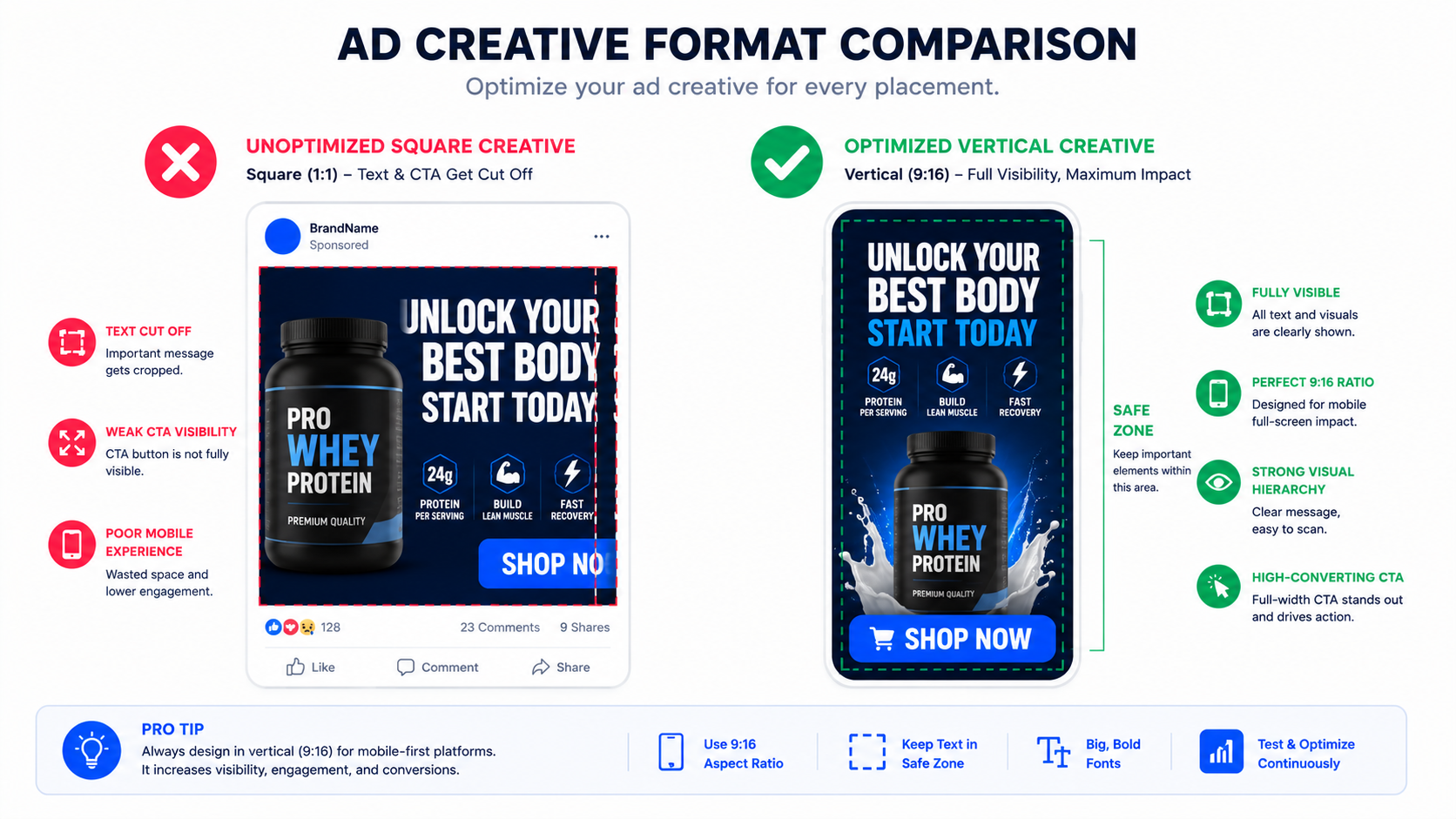
- The CTA button doesn't fit on the screen without scrolling
- The font is too small for a finger
- Images take 5+ seconds to load - the user leaves
- A form with 6+ fields - only a few will fill it out
What works on mobile:
- All important information on the first screen without scrolling
- A full-width CTA button
- A form with a maximum of 2-3 fields (name + phone for nutra, only email for gambling)
- Loading speed faster than 2.5 seconds - this is critical
How cloaking is connected to landing page psychology
The connection is direct, and it is often overlooked.
When a moderator lands on your page and sees not an offer, but a White Page - that's good. But the White Page must also look convincing. A bad White Page is a red flag for a manual check. A good one - causes zero suspicion.
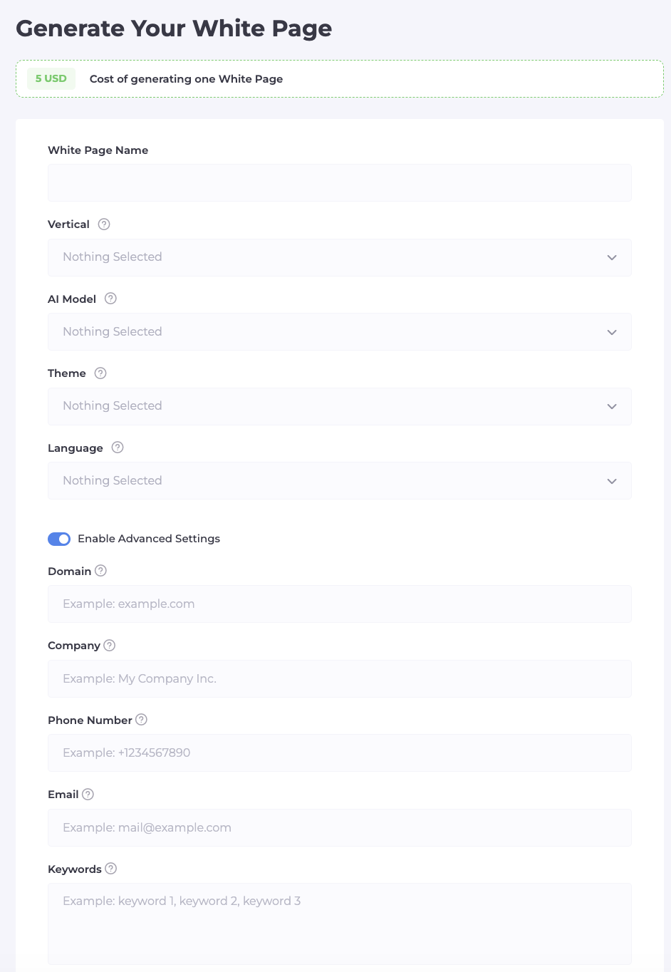
Cloaking.House has a built-in AI generator for White Pages. Instead of manually creating a neutral site, you choose a theme (health, finance, news) and get a ready-made page in 2 minutes - with normal content, structure, and the appearance of a real site.
For the offer page, the principle is the same: the system directs to it only verified traffic that has passed through all filters. This means that conversion analytics are not polluted by bots and moderator visits - you see a pure CR and can actually optimize the page.
Bottom line: what to check on your landing page right now
Go through this checklist:
- Does the first screen headline talk about a pain/desire, and not about the product?
- Is there one clear CTA on the first screen?
- Is the button contrasting and with a specific benefit in the text?
- Is there a microtext under the button that removes an objection?
- Are there real reviews with a name, photo, and specific result?
- Is there an element of urgency or scarcity (not fake)?
- Does the landing page load faster than 2.5 seconds on mobile?
- Does the White Page look like a real site?
Every "no" is a conversion you are losing right now. Try Cloaking.House for free for 7 days - and start with making sure your White Page finally raises no questions from moderators.





Be the first to share your opinion!
We value your feedback — share your thoughts.